Fictional architecture studio · KOODOS portfolio piece
Datum: a fictional architecture studio, drawn from its coordinates
A self-initiated portfolio piece: the website of an architecture studio that doesn't exist, where every pattern grows from each project's latitude and longitude. Built to an award-level standard, and to a tight performance budget: 99, 100, 100, 100 on Lighthouse mobile.
Make every project's identity come from its ground. Each project's latitude and longitude seed every pattern on its page, so the same place always draws the same way. Spend the boldness on four signature moments and keep everything else calm and fast, with a performance budget enforced on every change. Datum always says plainly, everywhere, that the studio is fiction and just a portfolio example showcasing design and technical competancy.
02Outcome
99Lighthouse performance on mobile, with 100 for accessibility, best practices and SEOLive site, mobile, measured in an incognito window, 31 October 2026
About 3 KBJavaScript on a project pageAgainst a 40 KB budget. Three.js loads only on the home page, after the first scroll
0.00Layout shiftEvery image and drawing reserves its space before it loads
32 of 32Colour combinations passing WCAG AAEvery palette, accent and mode, tested automatically. The first run caught two failing accents; both were fixed
2 daysFirst commit to feature-complete30–31 October 2026. About 20 pull requests, each merged only after lint, type checks, build, tests and Lighthouse CI passed
Largest image in 2.0–2.5 sThe one budget line not yet metAgainst a 1.5 s target in the CI's slow-4G simulation. The site publishes this on its own Lab page
01The challenge
Most of what KOODOS is known for is research: GroundWork, the Demand Map and the numbers behind what sort of website to build, and why. That work is why a site gets found, but it leaves the design side of the practice harder to see. Client sites are built for their market, not for a portfolio, so they rarely show the whole range of what's possible.
Datum is my answer to that: a self-initiated piece, built to the standard of an award-level studio site, to show the craft behind the strategy. The idea was simple. It had to look like a premium studio's site, load fast on a phone, and be honest about what it really is.
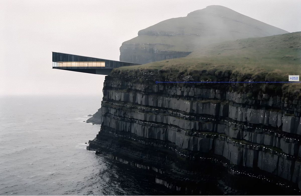
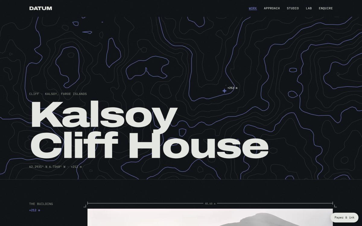
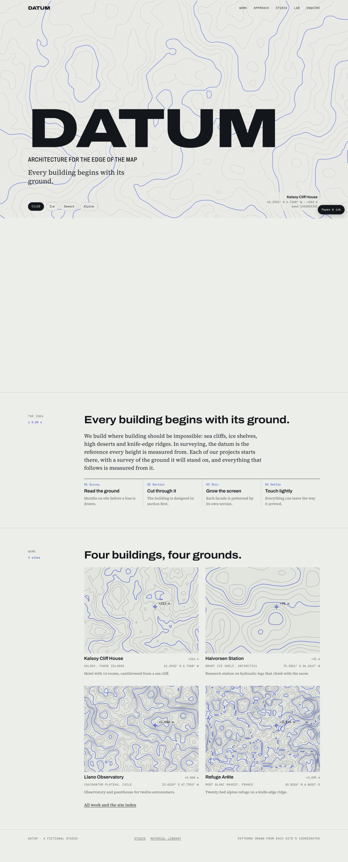
Datum is a fictional architecture studio that builds in impossible places: a sea cliff in the Faroe Islands, an Antarctic ice shelf, a high plateau in Chile and a knife-edge ridge on Mont Blanc. The studio, its people, awards, press and open roles are all invented, and the site says so: in the footer, at the top of the Studio page, beside the awards and the press, and at the end of every job ad, which close with "None of these roles exist, because Datum does not. KOODOS does." Its structured data marks it up as a fictional work published by KOODOS, never as a company. Enquiries come to me.
02The work
Identity from a place
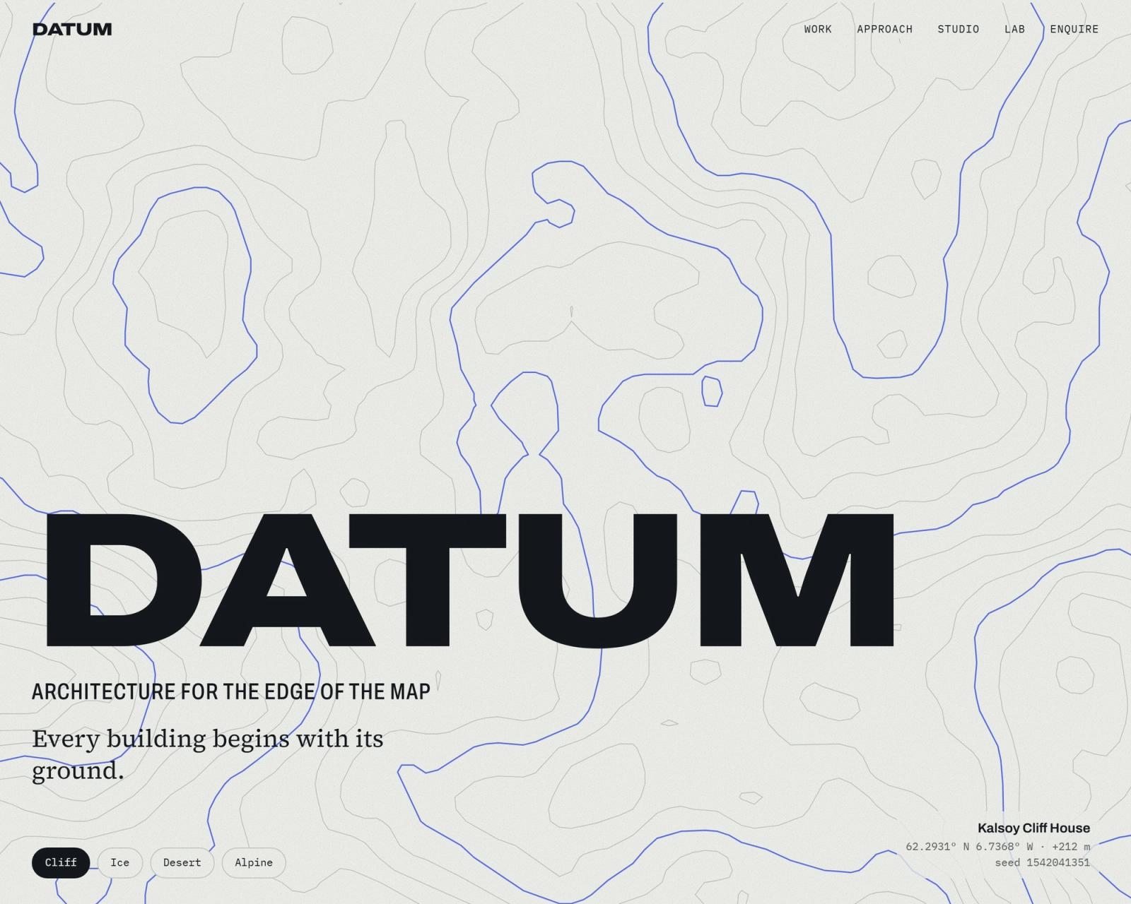
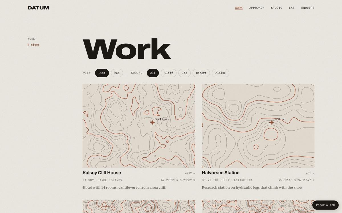
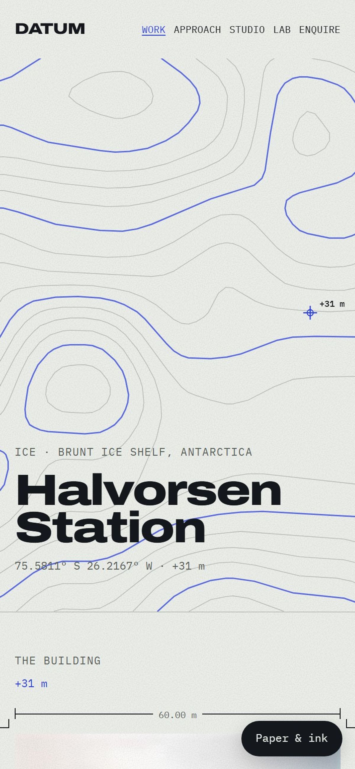
In surveying, a datum is the reference every height is measured from. The site's line is "Every building begins with its ground", and it is meant literally. Each project's latitude and longitude seed every pattern on its page, so the same coordinates always give the same drawing. The logo stays fixed; the ground under it changes.
There are five graphical patterns at play within the site, and each has one job. Contours are each site's signature. Dither is how images arrive. Cells become the building skins. Hairlines are the survey marks around images, and grain gives the page its paper. They come from my pattern toolkit, something I built to help my everyday work, but extended for this site.
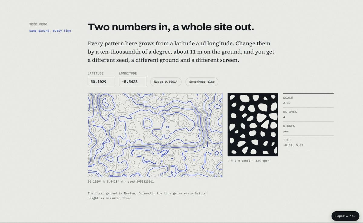
The Lab page has a seed demo. Move the latitude by 0.0001°, about 11 metres, and the ground, the seed and the facade all change.
The Lab's seed demo. Pages that aren't projects start at Newlyn, Cornwall, the tide gauge British heights are measured from.
Four ‘moments’, & everything else calm
A site like this can easily turn into a showreel. Instead it has four signature moments, and everything else stays quiet so they dont compete with each other.
Ground to form. On the home page a contour drawing paints first. On the first scroll a 3D terrain takes over with no visible jump, then lifts and tilts to show the building.
Site morph. Moving between projects, the contours flood in lowest ground first, and images dissolve through a dither pattern.
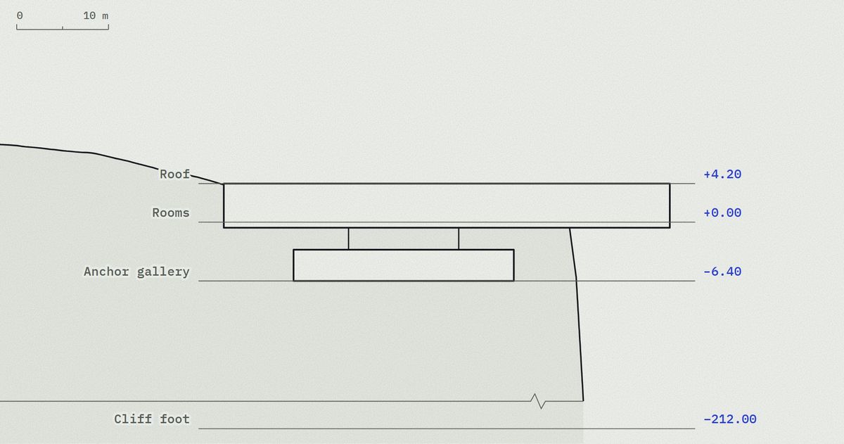
Section draw. Each building's cross-section draws itself as you scroll, at true scale, with the spot heights counting up.
Your ground. On the enquiry page, type in your own site's coordinates and watch the same generator draw its signature.
Kalsoy Cliff House in section, at true scale. The drawing builds as you scroll.Renders are AI-generated, art-directed as one series in one overcast grade.
A brand system as a sheet of paper
The whole palette is six colour tokens. On top of them sit four palettes, four accents, and light and dark modes. Visitors can change them with a control called Paper & ink, and every pattern redraws in the new colours, including the 3D hero.
A project page in dark mode.The work index in the Sandstone palette with the Deep oxide accent.
Pages that reuse the drawings
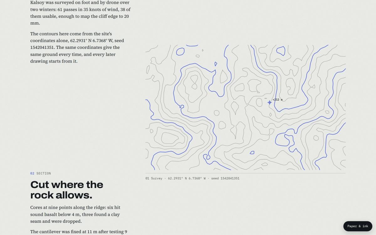
The Approach page tells one project story, Kalsoy Cliff House, as a four-step scroll story: survey, section, skin and settle. Each step reuses a drawing the project page already has, so the story and the project can't drift apart.
Approach, step one: the survey, drawn from the site's coordinates.
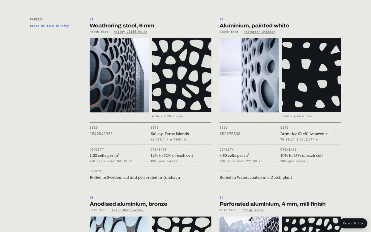
The Material Library sets the four building skins side by side: a photograph of each material, a crop of the real screen at true density, and the numbers behind it, from the seed to how open the screen is.
The Material Library: each skin with its seed, density and openings.
Clarity first
The boldness is in how the pages look, never in where things are. The header has five links on one line, even on a 320-pixel phone, so nobody has to learn the navigation.
A project page on a phone.
03The outcome
Measured on mobile in an incognito window, the live site scores 99 for performance on Lighthouse and 100 for accessibility, best practices and SEO.
Those scores are held in place, not lucky. Lighthouse CI runs on every pull request (update), simulating a slow 4G phone, and a change that drops any page below 95 is stopped in its tracks. After each update, the latest numbers publish themselves to the Lab page.
A project page ships about 3 KB of JavaScript against a 40 KB budget. Three.js, the 3D library, loads only on the home page and only after the first scroll. Nothing shifts as the page loads. The fonts were cut down to the characters and weights the site uses, from 167 KB to 113 KB. Every drawing is rendered before it reaches the browser, so the site works without JavaScript; scripts only add motion.
Accessibility is tested, not assumed bacuase of its importance to all users, not jus the scores themselves. Every colour pairing is checked against WCAG AA in all 32 combinations of palette, accent and mode. On its first run the test caught two accents that failed, and both were fixed. Every animation has a reduced-motion version, and that is tested too.
What it means for a business website
Most businesses don't need a 3D hero. They do need what sits underneath it: a brand system that holds together, a performance budget a slow change can't break, accessibility that is tested rather than hoped for, and the search basics done properly. The same discipline works on a five-page site.
Cookies. This site sets none by default. Accept and it loads
Google Analytics and Google's booking tool, which set
their own. Decline and booking opens in a new tab instead — everything else
works the same.